Netherlands Crop Viz
Scrollytelling Data Visualization
A scrollytelling precision agriculture data visualization showing how compounding risk signals silently slash Dutch agricultural output — quantifying €70M+ potential loss.

Overview
Make compounding agricultural risk visible.
Netherlands Crop Viz turns agricultural data into an eleven-part, scroll-driven story. Charts and annotated visuals show how separate risk signals can combine into a larger effect on Dutch crop output, including an estimate of more than €70 million in potential loss. The pacing lets readers understand each signal before seeing the combined picture.
Engineering decisions
- 11-section scroll-driven narrative architecture
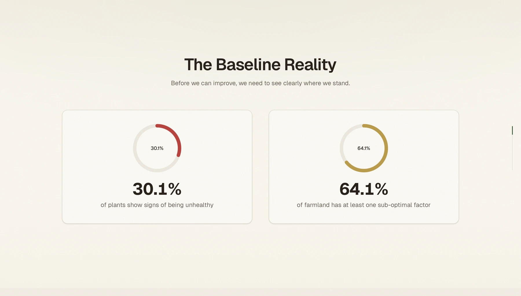
- Custom SVG ring gauges & scroll-driven bar charts
- Agriculture-themed OKLCH color system
- Accessibility: prefers-reduced-motion support
Built with
- Next.js
- React
- Tailwind CSS
- Framer Motion
- Recharts
A closer look
Behind the build.
A single yield number hides the risks behind it.
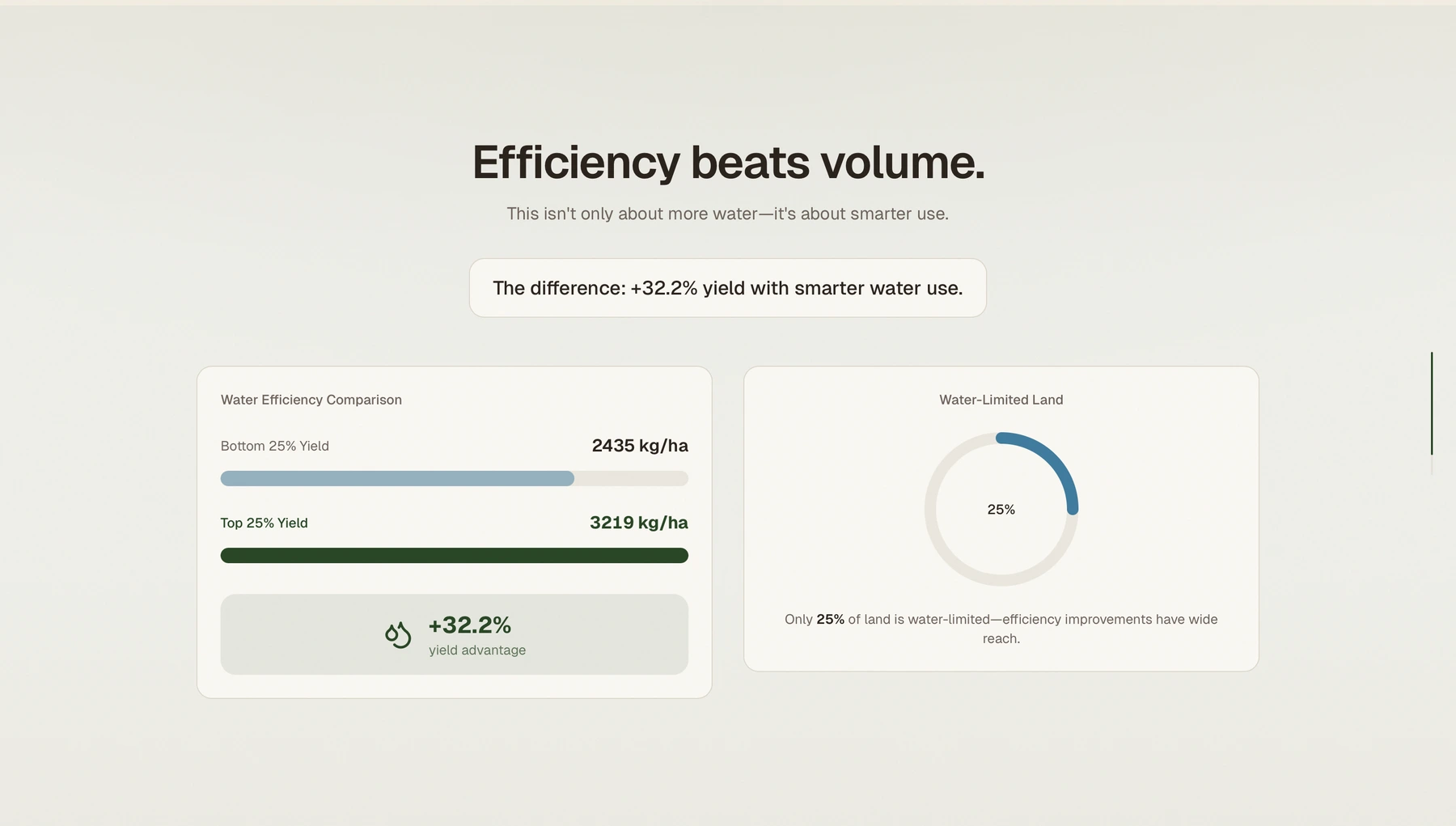
Netherlands Crop Viz asks readers to look at agricultural conditions as a combination of signals: plant health, weather, water, and accumulated field risks. The goal is to make relationships in the supplied dataset easier to inspect than they would be in a static table.
Reveal one layer of the data at a time.
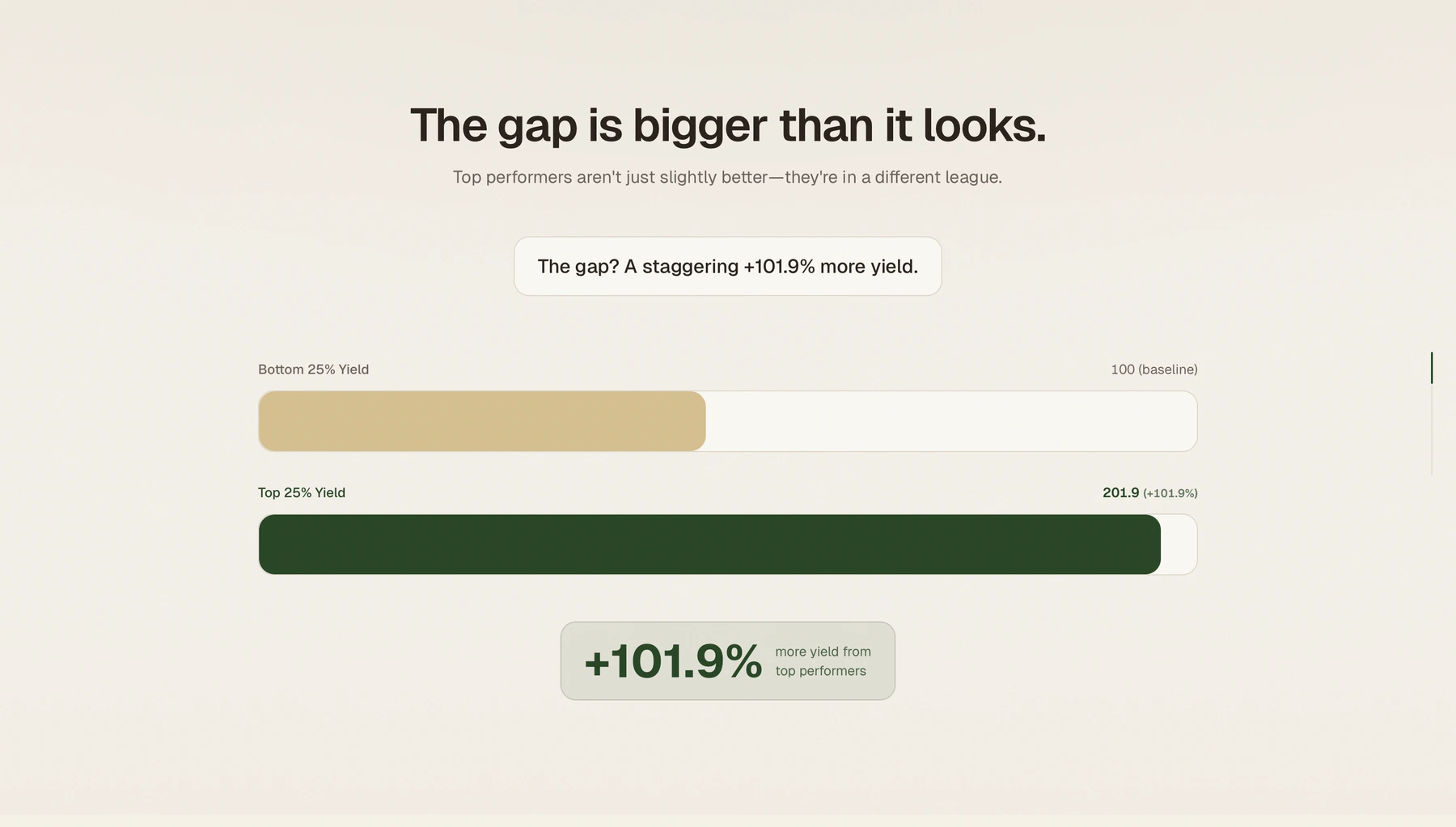
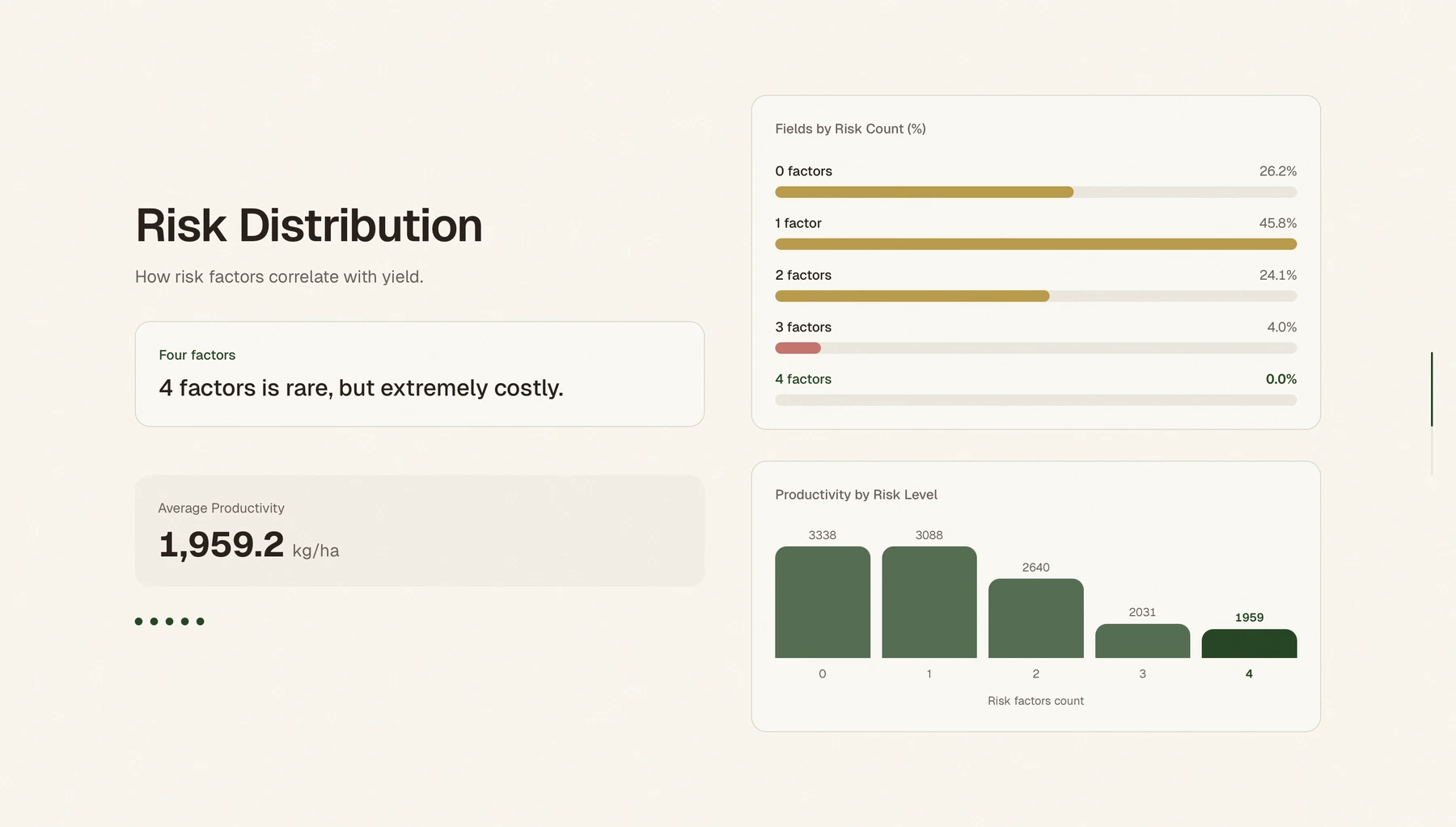
Eleven scroll-driven sections move from a baseline through productivity gaps and risk distribution to a potential-loss scenario. Animated metrics, ring gauges, bar charts, and a pinned scene support the sequence. Reduced-motion handling keeps the data readable when animation is disabled.
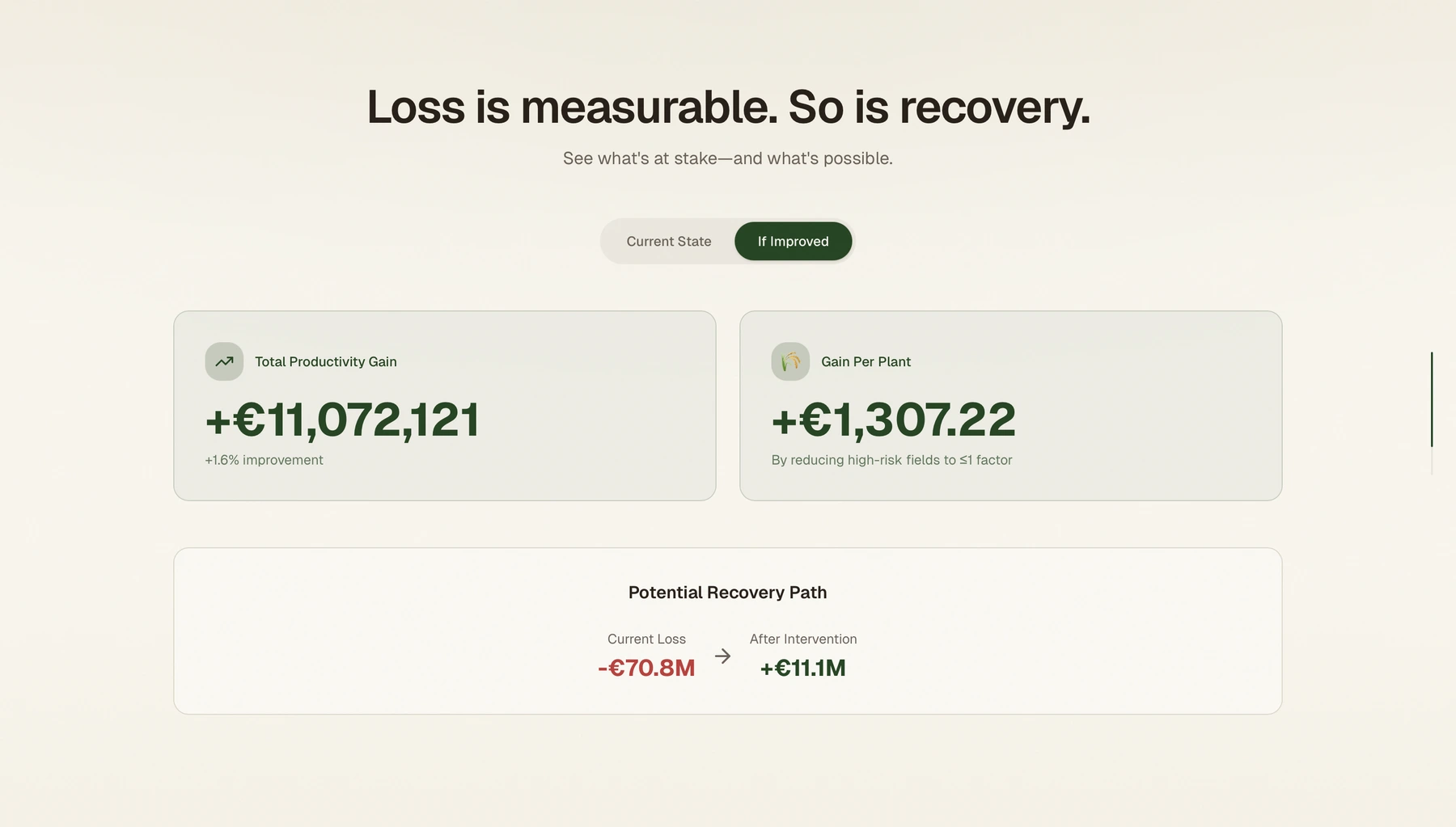
Treat the €70.8M figure as a scenario.
The loss and recovery figures are values represented in the project's data module and visualized by the site. They illustrate the scale of a potential outcome within that scenario, not a verified loss across Dutch farms. The story presents associations in the dataset without claiming that the charts establish causation.
Inside the product
From the app itself.